
Financial Management Models of a Great Nonprofit Dashboard
Editors’ note: This article was adapted from a webinar presented by the Nonprofit Quarterly on February 17, 2016. The webinar was led by Hilda Polanco, founder and CEO of FMA, the go-to capacity builder to which foundation and nonprofit leaders turn to address nonprofit financial-management issues. Polanco was a founding member of the selection committee of the New York Nonprofit Excellence Awards, established by the New York Times and the Nonprofit Coordinating Committee. When not speaking publicly or leading FMA’s team, she provides direct capacity-building, training, and coaching services to foundations and nonprofits across the country. This article is from the Nonprofit Quarterly’s spring 2016 edition. It was first published online on May 9, 2016.
Nonprofits are complex enterprises. They are built around mission and desired outcomes but must be supported by the right revenue and expense models—which together comprise an integrated enterprise model. As an organization’s goals, strategy, and operating context shift over time, a dashboard allows a nonprofit to monitor both the effectiveness of this enterprise or business model, as evidenced by the organization’s financial health, and the impact of the programs and services being provided.
Ideally, dashboards are presented quite simply and graphically, so that decision makers can see at a glance whether and where the organization is on the path it has laid out for itself. Dashboards focus the conversation at the board and staff levels, clarifying the goals and strategy of the organization for both groups. Additionally, dashboards can be used with funders and other stakeholders to transparently show progress toward the desired goals.
This article focuses more on the financial component of a dashboard than the programmatic one, and it uses examples from organizations that deliver a relatively more “countable” service than those doing less tangible advocacy work. But the examples demonstrate many of the critical principles involved in dashboard creation, and are a good start to understanding the components of a great dashboard. The aim of this article is to set readers on the path toward creating an effective dashboard or improving one already in use.
The Process of Developing a Dashboard
The hard work in developing a dashboard starts with setting a strategy, establishing goals, and defining the associated metrics. This process should involve the board and key staff from across the organization in rigorous, team-based discussions. These discussions should be ongoing, because no dashboard is final. While some baseline metrics, especially financial measures, might be a semipermanent fixture on a dashboard, parts of any dashboard may be experimental. They should illustrate a hypothesis in a form such as, “If we do more of this, then we expect this outcome as a result.” Due to environmental, technological, or market changes, however, formulas that work one way today may function differently tomorrow, and it is important to continue to question, evaluate, and reset not only goals and strategy but also the metrics being used to measure success.
A dashboard must do the following:
- Align definitions of success across the organization;
- Encourage dialogue about progress toward goals;
- Facilitate timely identification of successes and challenges;
- Ground decisions in concrete data and evidence; and
- Illuminate relationships between different activities.
Successful dashboards also do the following:
- Effectively communicate strategic-level results;
- Present data in a user-friendly visual format;
- Create a snapshot of current status as well as trends over time;
- Clearly show performance against defined targets;
- Highlight out-of-the-ordinary results; and
- Include a manageable set of key performance indicators (KPIs).
Selecting the Dashboard Elements
Deciding what data you will track and understanding how that data will influence decision-making are two of the most critical points in the process. There is no one-size-fits-all approach to creating a dashboard, though much can be learned by looking at other dashboards in (and also outside) your field of practice. One key question to clarify as you begin the dashboard design process is whether the dashboard will track metrics at an enterprise level or just for a particular program or function. Another question is that of audience: Will this be a reporting tool for your board, staff members, or funders—or some combination of the above?
As you begin to define what to measure, one of the issues to consider is interrelationships between data points. If you thought, for instance, that controlling staff turnover would improve the way patients experience service at your health clinic while at the same time lowering human resources costs, how would you test this idea? Your goals may be to control costs and provide better service and patient outcomes in some kind of measurable way, but first it is important to test your hypotheses about how one thing affects another. Dashboards can help you to connect the dots through carefully selected metrics. Then again, you may decide on a more independent goal, like developing a particular level of reserves or achieving a proportion of revenue that is unrestricted. These goals are related to financial stability and liquidity, and while there certainly may be some correlation between these goals and overall organizational performance, goals of this nature are less of an “if this, then that” proposition.
What Should We Measure?
The metrics measured on a dashboard are commonly referred to as key performance indicators, or KPIs, and should be chosen in a deliberate, thoughtful, and team-based process. KPIs should be identified by means of an understanding of your organization’s business-model drivers—on both the expense and the revenue side. Consider each revenue stream and the factors that influence the reliability and predictability of that stream; examine key expense categories and what contributes to the rising or falling of those costs; finally, define the program delivery mechanisms that are influencing results—enrollment levels, quality of patient care, member retention—whatever it is that drives engagement in your program delivery.
With this information in hand, select the KPIs that focus the organization on data that will support decision-making. Consider whether you need a dashboard that reflects trends over time or performance against goals—or both.
Successful KPIs do the following:
- Represent business model drivers;
- Reflect progress toward intended outcomes;
- Guide priorities and decisions (“what gets measured gets done”);
- Are limited to a number that can realistically be monitored (the key in KPIs is important); and
- Are periodically reassessed (a set of KPIs isn’t forever).
Business Model Drivers
Different types of nonprofits have different enterprise models with different drivers for success. In many cases, we can learn a great deal from examining the dynamics of organizations that have drivers similar to our own—sector notwithstanding—but there are times when we will need also to look at the specifics. As we proceed, we will look at specific business models to clarify how to identify the drivers in each model and design KPIs relative to those drivers on a dashboard.
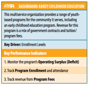
Early Childhood Education: Key Driver – Enrollment
We will begin with an organization that provides early childhood education. Whenever you have a fee-for-service delivery model, as in this example, it is important to monitor enrollment levels and the profitability of the programs given those enrollment levels. So, in this case we’re going to look at three particular things—we’re going to track enrollment; we’re going to track the resulting revenue from our enrolled program participants; and we’re going to monitor the overall surplus/deficit of the program. The questions we want to focus on as we analyze the results may include: Are we charging the right amount in fees? Are we collecting on those fees? Are we underenrolled? Are our costs low enough for us to generate a profit?
Below is a picture of what a dashboard for an early childhood education program might look like. A key thing to note is that, with respect to the year-to-date operating results, we want to look at actuals against budget as well as against past performance. When we compare this year’s actuals to these two other data points, we can see right away how the organization is doing against its current plan, and how it is doing compared to last year’s performance.
Another key area to highlight is demonstrated in the picture’s bottom two charts. These charts address this idea of enrollment, separating out the data between full-time participants and part-time participants. The charts not only give us the enrollment for the past year (what the organization is hoping to accomplish) and where it is as of this point in time, but also make reference to maximum capacity. When it comes to enrollment as a key revenue driver, the question of whether the organization is achieving maximum capacity is an important one. At FMA, we often speak to program directors who feel challenged by the fact that they are asked or expected to budget at full capacity, when in fact, historically, they’ve never reached full enrollment. So, how realistic is that budget? In contrast, the early education dashboard allows us to see where the organization is really pushing: on the half day, for the four-year-olds, it’s budgeting at maximum capacity. It hasn’t reached that level in the past, and it’s not quite on track to reach it now, but that’s where the push is. We can see in other classes that there’s an acknowledgment that the organization hasn’t reached maximum capacity in the past and is not expecting to reach it this year, either.
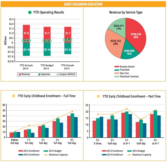
These measures give a sense of how this organization is planning relative to the past, and they emphasize the primary importance of program enrollment as a business driver; the organization will never realize its revenue goals if it doesn’t have the individual children in the individual seats at the right pricing. The conversation around this dashboard, therefore, brings program managers into a very deep engagement around the financial outcome of enrollment, and it helps program staff understand the consequences of not reaching the stated goal.
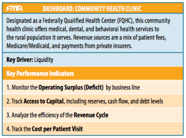
Community Health Clinic: Key Driver – Liquidity
Community health organizations are another type of direct service provider, and, in the healthcare world, operational efficiency is a very important driver. In this vein, the key things that community health clinics may want to look at include the optimization of the revenue cycle as well as the cost per patient served. In this type of organization, there is also often a heavy facilities component. So, if you run a clinic—or any type of organization that requires funds to maintain buildings and capital equipment—you want to keep your eye on whether you have the reserves you need, the cash flow, and the ability to carry the level of debt that may be required in order to maintain the necessary facilities and equipment.
The business model of a clinic ultimately depends on the organization’s ability to deliver high-quality patient care; but, on the financial side, the key is getting the cash to come in the door as quickly as possible to fund the operations. As soon as the mechanism for billing starts to slow down, liquidity comes to a halt. It’s a different model than that of a foundation-funded organization, where there is a $100,000 grant that comes in at the beginning of the year and the organization is set. In this world, revenue optimization has to be continuously refined, with attention paid to the engine that drives the cash while at the same time ensuring a focus on patient quality of care. You can see how significantly the priorities of this model differ from the enrollment statistics from the previous dashboard example.
Anyone who has attended an FMA workshop or webinar has heard us talk about months of liquid unrestricted net assets—or LUNA, for short. LUNA is essentially equivalent to the idea of operating reserves. In this particular case, the goal is to have three months of LUNA—and they’re working on it, but they’re not quite there yet. So, you can tell right away that there’s a goal, and that it hasn’t yet been reached—and you can ask what it will take to get there. There are charts that track cash flow and debt—all in service of making sure the organization has the resources it needs to remain sustainable, flexible, and able to meet any challenges it may have in maintaining adequate facilities in which to provide services.
This article was written by Hilda H. Polanco and Sarah Walker and published by Nonprofit Quarterly.